Best Paint Colours for Neurodiversity

Updated: Jul 31

Walk into any room and one of the first things you'll notice—often without even realising it—is the colour.
Colour influences how a space feels. It can make a room seem larger, smaller, brighter, warmer, more welcoming, or more energising. For most people, paint colours are chosen based on personal taste or current design trends.
But for neurodivergent individuals, colour can have a much deeper impact on everyday comfort, concentration, and wellbeing.
As conversations around neurodiversity become more prominent, designers, employers, educators, and homeowners are beginning to think differently about the environments they create. Instead of focusing solely on aesthetics, there's growing recognition that interior spaces should support the people who use them. Colour is one of the simplest and most effective ways to achieve that.
While there is no single colour palette that works for every neurodivergent person, certain shades consistently prove more supportive in spaces designed to reduce sensory overload and promote a sense of calm. Whether you're decorating a family home, planning a classroom, designing an office, or creating a sensory-friendly hospitality environment, thoughtful colour choices can make a remarkable difference.
Why Colour Matters More Than We Think
Many people underestimate the role colour plays in shaping their experience of a space.
Some colours naturally draw attention and stimulate the senses. Others have a softer presence, allowing the brain to relax and process information more comfortably. For neurodivergent individuals, particularly those who experience sensory sensitivities, these differences can be significant. |
A brightly coloured room filled with strong visual contrasts may feel energetic and exciting to one person, yet overwhelming and distracting to another. Similarly, a calm and muted environment may help someone feel grounded, focused, and able to engage more comfortably with their surroundings.
The relationship between colour and sensory processing isn't always straightforward. Individual preferences, life experiences, and personal associations all play a role. However, designers who specialise in sensory-friendly environments often observe similar patterns.
Spaces that use softer, more natural colour palettes tend to feel more accessible to a wider range of people.
Rather than creating environments that constantly compete for attention, these spaces provide visual breathing room.
Understanding Neurodiversity and Sensory Needs
Neurodiversity is an umbrella term used to describe natural variations in how people think, learn, communicate, and process information.
It includes individuals with autism, ADHD, dyslexia, dyspraxia, Tourette syndrome, and other neurological differences. While every neurodivergent person is unique, sensory processing differences are common.
Some people may be particularly sensitive to noise, lighting, textures, smells, or visual stimulation. Others may actively seek sensory input. This is why creating inclusive spaces is rarely about following a rigid set of design rules.
It's about understanding that people experience environments differently and providing settings that accommodate a variety of needs.
Looking to Nature for Inspiration
When in doubt, nature often provides the best design guidance.
Natural colour palettes have a way of feeling familiar and reassuring. Soft sand tones, muted clay colours, warm stone shades, and earthy browns often create environments that feel comfortable without demanding attention.
Many designers who specialise in wellbeing-focused interiors intentionally draw inspiration from natural landscapes.
The reason is simple.
Nature rarely overwhelms the senses.
A woodland path, a quiet beach, or a rolling countryside landscape contains colour, texture, and visual interest, but these elements exist in balance. Translating those colours into interior spaces can help create similar feelings of comfort and ease.
This approach is particularly effective in environments where people spend long periods of time, such as homes, schools, workplaces, and care settings.
The Power of Soft Greens
If there is one colour family that repeatedly appears in discussions around sensory-friendly design, it is green.
Not bright lime green or vivid emerald, but softer, muted shades inspired by nature.
Sage green, olive green, eucalyptus, and moss tones have become increasingly popular in recent years, and not simply because they are fashionable. These colours tend to create a sense of balance and calm that many people find comforting.
Part of this may be linked to our natural connection with outdoor environments. Green is associated with trees, plants, and landscapes—places that many people instinctively find restorative.
In a home setting, soft greens can work beautifully in bedrooms, living areas, and home offices. In schools and workplaces, they provide visual interest without becoming distracting. They also pair well with natural materials such as wood, stone, and linen, helping create interiors that feel warm and grounded.
Unlike brighter greens, which can sometimes feel energetic or intense, muted green shades generally offer a gentler visual experience.
Why Blues Remain a Popular Choice
Blue has long been associated with calmness, and for good reason.
Many people instinctively connect blue with clear skies, water, and open spaces. When used thoughtfully, it can create environments that feel peaceful and predictable.
For neurodivergent individuals, predictability matters.
Spaces that feel visually calm can help reduce the cognitive effort required to process surroundings.
Soft blues are particularly effective in areas designed for concentration and relaxation. Bedrooms, reading nooks, study spaces, therapy rooms, and quiet work areas often benefit from these tones.
The key is choosing the right shade.
Very bright or heavily saturated blues can sometimes feel cold or overstimulating. Muted blue-greys, powder blues, and dusty blue tones tend to work best in sensory-conscious environments.
These colours create a sense of calm without making a room feel clinical or sterile.
The Appeal of Warm Neutrals
Neutral colours are often misunderstood.
People sometimes assume neutral means boring, but when used well, neutrals can create some of the most comfortable and welcoming interiors.
Warm whites, soft beiges, creamy ivories, and gentle taupes provide a sense of visual stability that many people appreciate. They offer a quiet backdrop that allows furniture, artwork, and personal belongings to stand out without creating unnecessary visual noise. |
This is particularly important in spaces where individuals may already be processing a large amount of sensory information.
Bright white walls, while popular in modern interiors, aren't always the best choice. Under certain lighting conditions, they can feel stark and reflective. A warmer off-white often achieves the same sense of openness while creating a softer overall atmosphere.
Many sensory-friendly environments use warm neutrals as a foundation before introducing subtle accent colours throughout the space.
The Rise of Greige
Greige—a blend of grey and beige—has become one of the most popular interior paint colours of the past decade.
There is a reason for that popularity.
A good greige strikes a balance between warmth and neutrality. It feels modern without becoming cold and calming without feeling dull.
In neuro-inclusive design, greige can be particularly effective because it avoids strong visual stimulation while still adding depth to a room.
It works well in almost any setting, including:
|
Its versatility makes it an excellent choice for shared environments where users may have different sensory preferences.
Colours That May Require More Consideration
There is no universal list of colours that should be avoided. Personal preference will always matter.
However, some colours tend to generate stronger sensory responses than others.
Bright reds, neon yellows, fluorescent greens, and highly saturated oranges naturally attract attention. They can create energy and excitement, which may be useful in certain environments.
The challenge arises when these colours dominate a space.
Large areas of highly stimulating colour can become visually demanding, particularly for individuals who are sensitive to sensory input. They may make it harder to concentrate, relax, or feel comfortable in the environment.
This doesn't mean vibrant colours should never be used.
In many cases, they work best as accents rather than primary wall colours. A carefully chosen cushion, artwork piece, or decorative accessory can introduce personality without overwhelming the room.
Remember To Consider The Following:
|
Creating Inclusive Spaces Isn't About Following Trends
Interior design trends come and go.
A colour that dominates social media today may feel dated in a few years. Inclusive design, however, is built around people rather than trends.
When selecting paint colours for neurodiverse spaces, the most important question isn't whether a colour is fashionable. It's whether it helps create an environment where people feel comfortable, supported, and able to be themselves.
Sometimes that will mean choosing a calming sage green. Other times it may involve a warm neutral, a muted blue, or an earthy clay tone.
The right choice depends on the individuals using the space and the purpose that space serves. There is no one-size-fits-all solution.
The Scientific System Framework
So just as there is no one size fits all in terms of colours, likewise it's worth noting that No single paint manufacturer’s chart or one brand system is universally recognised as the definitive global standard for sensory design.
Instead, sensory design relies heavily on scientific parameters like Light Reflectance Value (LRV) and the Munsell Colour System.
Design standards are typically set by independent accessibility frameworks and academic research rather than corporate colour decks.
THE MUNSELL COLOUR SYSTEM SENSORY PAINT COLOUR GUIDELINE The Munsell Colour System is a 3D scientific framework that categorises colours based on exactly how the human eye and brain perceive them, rather than how pigments are mixed. In sensory design—particularly for neurodivergent, autistic, or trauma-informed spaces—it acts as a universal language to strip away the marketing fluff of commercial paint charts and engineer environments that strictly control neurological arousal. [1, 2, 3, 4, 5] It does this by mapping colour across three precise, measurable dimensions: Hue, Value, and Chroma. [1, 2] |
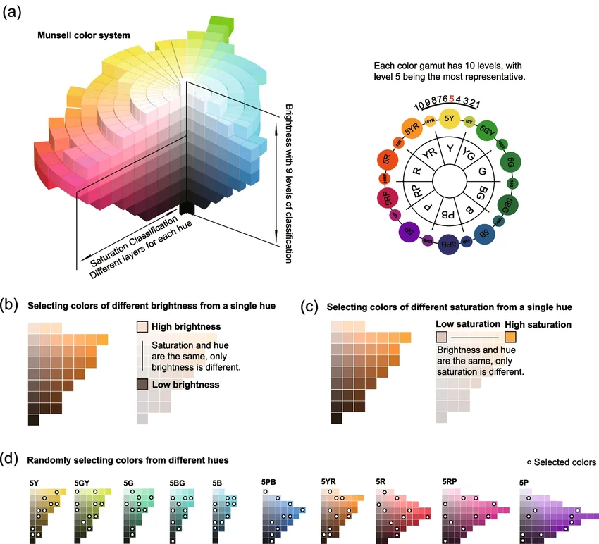
The Three Core Dimensions in Sensory Design The system writes colour as an exact formula: Hue Value/Chroma (e.g., 5G 8/2). Each variable plays a distinct role in managing sensory stimuli: | ||
Colour Variable | What It Is | Sensory Application |
Hue The Colour Family
| Designers use the Munsell hue circle to choose wavelengths that naturally demand less cognitive processing. Cool, | Cool short-wavelength hues like Greens (G) and Blues (B) are mathematically proven to calm the nervous system. Long-wavelength Reds (R) and Yellows (Y) act as neural stimulants and are intentionally restricted to avoid triggering hyper-reactivity or physical anxiety |
Value The Lightness Scale The most crucial dimension for preventing physical disorientation. | A vertical central axis graded from 0 (pure black) to 10 (pure white). It dictates how much light a surface reflects. | High values (near 9 or 10) can cause blinding glare and visual fatigue, which can induce sensory meltdowns. Conversely, values that are too dark can create cavernous, anxiety-inducing shadows. |
Chroma The Purity/Intensity High chroma is the absolute enemy of sensory design. Saturated, high-chroma environments overstimulate the visual cortex. | The horizontal distance radiating out from the grey center axis. A chroma of 0 is a completely neutral grey, while a high chroma (e.g., 14 or higher) is a radically intense, screamingly vivid color. | Using Munsell, a designer can explicitly mandate a low chroma ceiling (typically 1- 4). This ensures the colour is heavily muted, grayed-down, and soft, irrespective of what brand of paint is actually bought. |
Just to clarify, Munsell is a scientific measuring system, while premium paint brands like Little Greene, Benjamin Moore and Farrow & Ball are actual paint manufacturers. They are also superior brand choices for sensory design. Munsell does not make or sell architectural wall paint; it is simply a 3D blueprint that maps how human eyes perceive colour.
The standard high street paint brands that most people are familiar with use consumer formulas that rely heavily on synthetic black and white tinter bases. By contrast, Little Greene, Farrow & Ball and Benjamin Moore (Aura line) are known for using complex, multi-pigment blends and rich mineral bases. This gives them a unique response to light that is incredibly beneficial for neurodiverse and sensory-sensitive spaces
The Elite Tier: Brands That Are Better for Specific Sensory Needs
If your priority is respiratory health, chemical sensitivities, or severe autism where tactile and olfactory triggers are acute, there are a handful of specialist "micro-brands" that surpass mainstream premium brands like Little Greene, Benjamin Moore and Farrow and Ball.
These three niche manufacturers provide superior physical and chemical benefits for specific sensory profiles:
PAINT BRAND | WHY IT'S BETTER | SENSORY IMPACT | BEST FOR |
| Most "Zero VOC" paints still use a petroleum-derived acrylic plastic binder to stick paint to the wall. Edward Bulmer Natural Paint uses zero plastic binders, substituting them with plant-based oils, chalk, and milk proteins. | Arguably the most breathable paint on the market. Ultra-low VOC level of 0.07% (<0.1 g/L) and emits zero synthetic gas. Scent is completely non-chemical, smelling faintly of natural earth and linseed. | Individuals who are sensitive to chemical and strong smells. |
| Their flagship product is Earthborn Claypaint. Rather than being a liquid plastic film, it's formulated with high-grade, natural clay | Claypaint naturally absorbs sound wavelengths, subtly dampening acoustics in an echoing room. It's also hygroscopic and so stabilises humidity levels. | Individuals highly sensitive to air quality, static, or ambient noise. |
| Lakeland Paints holds the official seal of approval from the British Allergy Foundation. | While other brands claim "Low" or "Zero" VOCs based on legal thresholds, Lakeland's specialised formulas are 100% independently certified solvent-free. | Chemotherapy patients, severe asthmatics, and newborns, offering the most sterile sensory environment possible. |
If Sensory Trigger Is | Best Brand Choice |
Visual Overstimulation & Glare | Little Greene (Absolute Matt) or Farrow & Ball |
Tactile, Scuffing, & High Traffic | Little Greene (Intelligent Matt) or Benjamin Moore (Scuff-X) |
Olfactory / Chemical Smells | Edward Bulmer (Plant-based) or Benjamin Moore (Eco Spec) |
Respiratory / Severe Asthma | Lakeland Paints or Earthborn Claypaint |
Next Steps & Resources
Review the Science: Examine the National Institutes of Health for systematic literature on indoor lighting and colour effects on sensory sensitivities.
Consult Sensory Experts: You could consider reaching out to specialised organisations like AsIAm for inclusive design guidance to ensure the space is fully tailored to neurodivergent or sensory needs. A Sensory Space is a bespoke design studio specialising in evidence-based sensory design for neurodivergent inclusive spaces.
Final Thoughts
Creating calm and inclusive spaces begins with understanding that people experience their surroundings in different ways. Colour alone won't determine whether a room feels welcoming, but it plays a surprisingly important role in shaping how a space is perceived and experienced.
Soft greens, muted blues, warm neutrals, greiges, and nature-inspired earth tones are often among the most effective choices for sensory-friendly environments because they offer visual comfort without sacrificing character.
Most importantly, inclusive design isn't about creating spaces that look a certain way. It's about creating spaces where people feel at ease.
When colour is chosen with care and intention, it can help transform an ordinary room into an environment that supports focus, well-being, and a genuine sense of belonging. That's something that benefits everyone, regardless of how their brain works.


Comments